All the details on the best dark paint colors to add moody contrast to your walls! Find the best dark paint color for your home with these tried and true colors.
If you’ve been following me for a little while, you know that I’ve been kind of obsessed with painting all. the. things. dark for a little while now! It all started with our small bathroom a few years ago, then our kid’s shared bedroom, then I did a bunch of our interior doors…and finally our family room! There’s just something about the contrast that the dark colors bring to a space – it’s incredibly cozy.
I also believe there’s a right and a wrong way to use dark colors in your home, in fact, I wrote a whole post about HOW to use dark colors in your home. Make sure you read that post first – there’s a lot of helpful information in there!
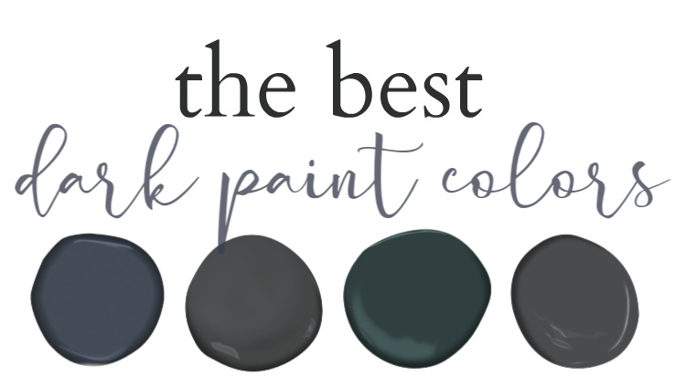
The best dark paint colors:
I’ve said it before and I’ll say it again. I think it’s VERY important to test paint samples out in your own home before you commit to a paint color. I have loved certain colors in other people’s homes and they just didn’t look the same in my home. I know it’s an annoying extra step, but it’s very important to test paint samples in multiples places in your room before you commit to a paint color.
I made a video to show you the unedited paint colors in our home (sometimes lighting/editing the paint colors changes the look slightly). See the video here, and then keep reading for my notes on each color and more pictures!
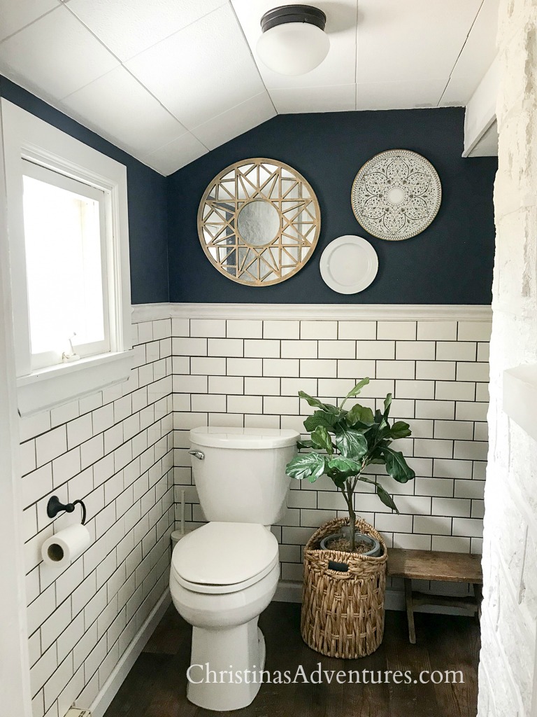
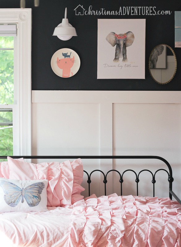
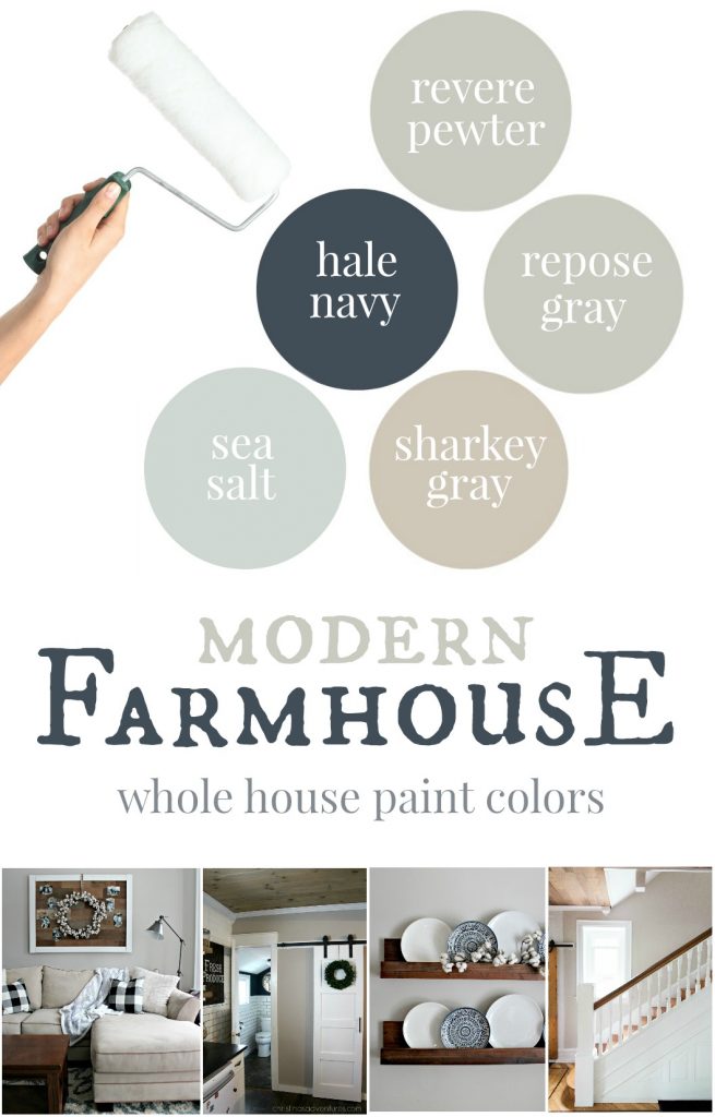
Hale Navy by Benjamin Moore
Hale Navy is a very deep true navy blue. It’s very nautical feeling, and a super rich color. It’s honestly one of my very favorite colors out there! We used it in our little bathroom, and love how it looks with the subway tile!
We also used Hale Navy in my kid’s shared bedroom. I love how it looks for a little boy’s room, but it also looks so sharp with light pink, so it worked perfectly for our little boy AND girl in their room. We really love it with the board and batten on the bottom of the wall!
Salamander by Benjamin Moore:
I took a little bit of a risk putting this color in our bathroom! But now I can’t imagine it being anything else! This little nook by our bathtub was originally going to be a beige color on top of the shiplap…imagine how different that would have looked (and not in a good way!) The salamander color brings so much depth and richness to this bath nook. I am in love with it!
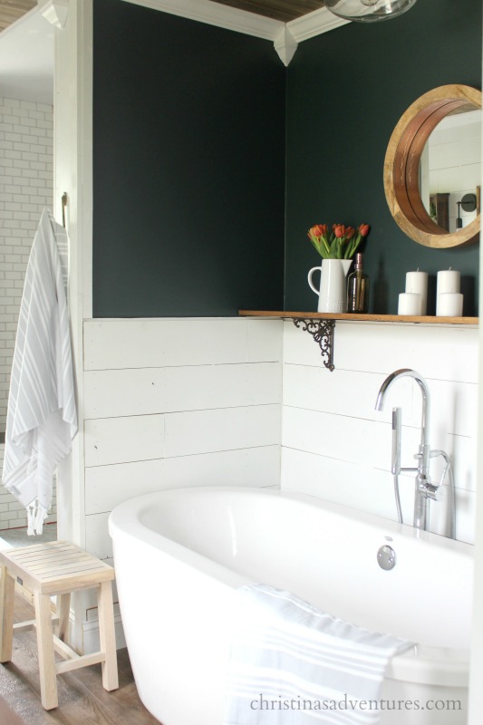
We went through a lot of paint samples to find Salamander! You can see how this all came together in this post – and see how many paint samples we had to try to find the right one!
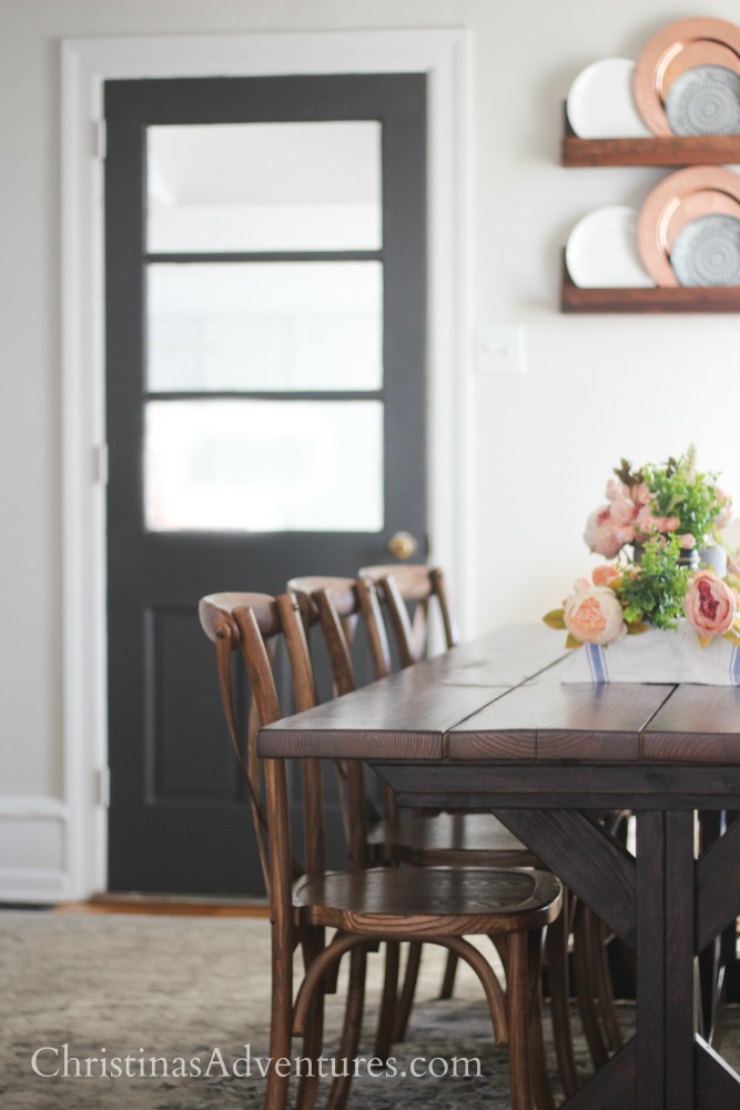
Wrought Iron by Benjamin Moore
I haven’t used this color on any walls in my home, but I have used it on many doors! I really like the color – it may be just a little bit lighter than some of the others on the list. It has slight blue undertones but it’s a pretty true gray.
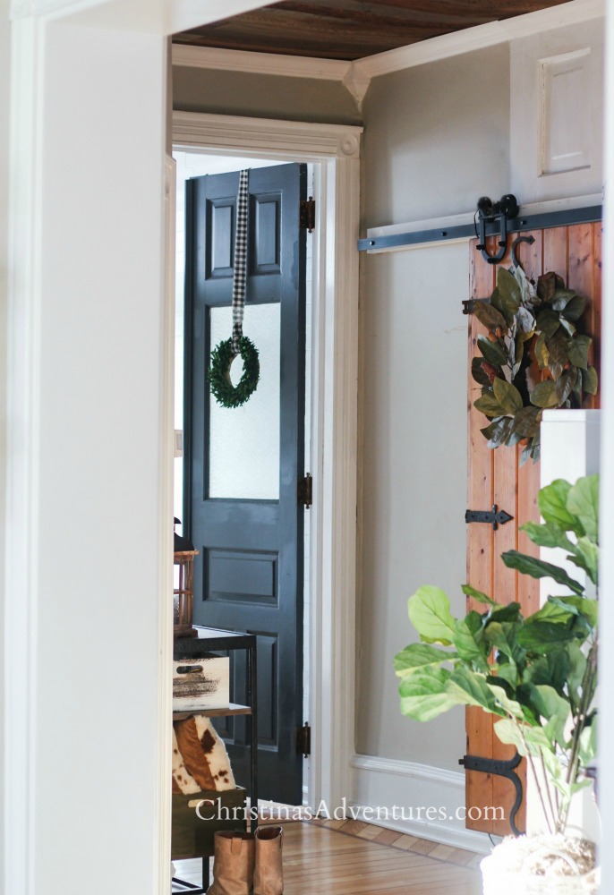
See all about how we painted this door with Wrought Iron and how much of a difference it made in this post
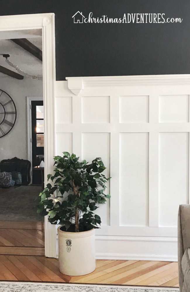
Nightfall by Benjamin Moore
Finally – the newest and possibly moodiest color to be added to our home! I added white board & batten in our family room, and I am really in love with the richness and depth of this color. It’s a beautiful deep gray with some slight blue undertones and I’m so glad I found this paint color!
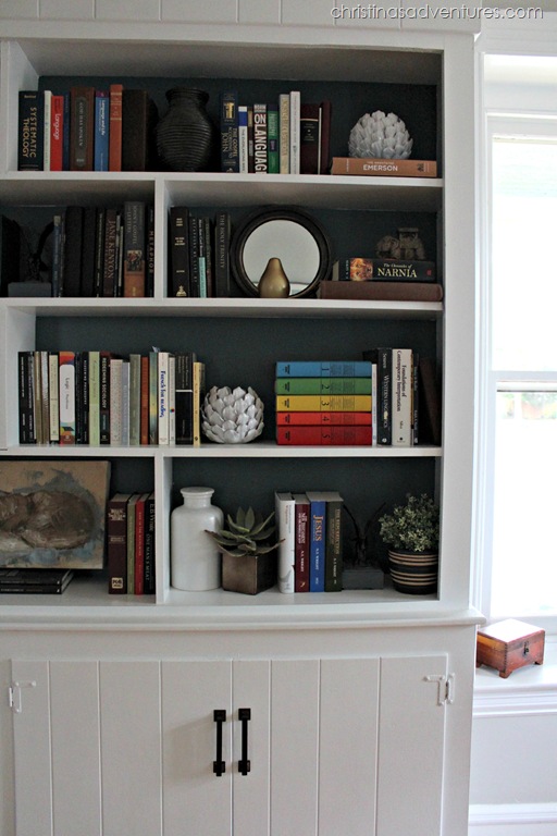
Relaxed Navy by Valspar:
I’m not sure I would love this color on a whole wall as much, but I love this as an accent color on the back of our built in bookshelves! When it’s in the back of these shelves, it darkens the color a little bit and provides a really pretty backdrop for the shelves.
I hope this helps to encourage you to go dark with a space in your home! It can help add depth to any space – just make sure you’re doing it right! Read here for my advice on HOW to use dark paint colors in any room.
And one of my most popular posts EVER is all of the modern farmhouse paint colors we use in our home – SO many good tips in there as well! Don’t miss this post!

Hi! Wondering what color white is beneath BM nightfall in the picture you posted. thank you!